Much like everything else on Earth, interior design inspires in me a number of opinions. Not so much about trends like bouclé, Togo couches, checkered rugs and disco balls, which will fade with time. Or leftovers from our broke eras: twinkle lights, crates as shelves, empty wine bottles with flowers or candles in them. And thankfully, none of my friends seem to be doing the absolute nonsense that is “turning your books around to make the shelf beige.”
No, my spidey senses tingle for the items and styles that my peers are, here and now, paying their hard-earned money for, and spending their precious time on, only to create spaces that are, in the very best case, “cutesy.” Not stylish or sophisticated or nice. Not pretty, not even cute…cutesy. And we gotta stop.
Because not all tackiness is created equal, I have divided the objectionable pieces into categories based on the severity of how much I dislike them.
Fine In Moderation
Movie posters
Posters are art and advertising. They aren’t really decor. But it’s become common among film-lovers to get a vintage, foreign or minimalist (my least favorite) poster for their favorite film and throw it up on the wall. This works…sometimes. It doesn’t communicate much beyond “here is a movie I like,” but if it’s not an eyesore and the rest of the room is well-appointed, fine. I cannot condone the use of a bunch of posters lining a hallway. I find movie posters work best in offices (where you’re meant to be inspired) and bathrooms (where you don’t spend extended periods of time).
Generally, I think if you like a thing, like that thing, not a picture of that thing. Watch the movies. You don’t need to cover your living space in reminders of the movies, because movies are movies and not personalities.
Posters for stuff besides movies should be evaluated on a case-by-case basis.
Full disclosure: I have two movie posters in my office/guest room/cat room. They are large, vintage posters for Kubrick’s Dr. Strangelove and Lolita, and I took them from my dad’s attic and got them framed. Are these my favorite two movies? No. But they have a vibe that fits the rest of the room. I also have bits of film strip from When Harry Met Sally (my favorite movie) in a lucite block on the window ledge above my toilet.
Words
We’ve collectively gotten over graphic tees and ‘Girlboss’ mugs, and I think the tide has finally started to turn on tote bags with kicky sayings, but inspo-decor persists. Particularly, a colorful quasi-feminist bumper sticker humor aesthetic that’s mostly found via Etsy and reminds me of HBO’s Girls. This idea works better on magnets than oil paintings, no?
Full disclosure: I have a pennant that says “do right and fear no man” in my office and a glittery fringe banner that says “love always” also in my office.
Anyway, here’s the deal: you can have as much of this stuff in your home as you want. But once you do, you’re not allowed to make fun of Midwestern moms with wooden cut-outs that say “Gather” in their kitchens, or influencers with “Live, Laugh, Love” in their Instagram bios, or even high school boys who scrawl “Why so serious?” on their bedroom doors, because this is the exact same thing.
The exact. same. thing.
A “Hot Girls Have IBS” cross-stitch and a “Please Leave By 9” banner and a “Crazy Cat Lady” doormat are no different than an “In This House, We Believe…” lawn sign. They’re a lower back tattoo of the Chinese character for Peace, a collection of Stanley cups, a Pumpkin Spice-scented candle. This style means you are basic, which is fine, but you don’t get to call anyone else basic ever again.
OK For Thee, But Not For Me
Trends that can work in other people’s homes, but which I’ll never embrace.
Colorful Velvet Couches
A couch takes up a lot of space so I understand the impulse get a pretty one. But it’s never going to be the prettiest thing in the room. At the end of the day, it’s a couch, so maybe don’t make it eye-catching. My preferred route is to go with one that isn’t ugly (no more gray!!!) but blends in with the other furniture and doesn’t draw attention. Brown leather, oatmeal-colored linen, a navy blue sectional with some throw pillows… also, velvet is pretty to look at but not very nice to sit on.
Stuff That Looks Like Other Stuff
Why have a nice pair of shoes and a nice table lamp when you can have an ugly table lamp that looks sorta like a shoe? These items never look like the things they’re shaped to be, or the things they actually are; they look like a toy version of both. It sticks out no matter how you decorate. It also goes back to the principle I mentioned in the posters section, of liking a thing, not a picture of the thing. Say you’re a big fan of fish: get some fish. Don’t get, like, a fish-shaped toaster.
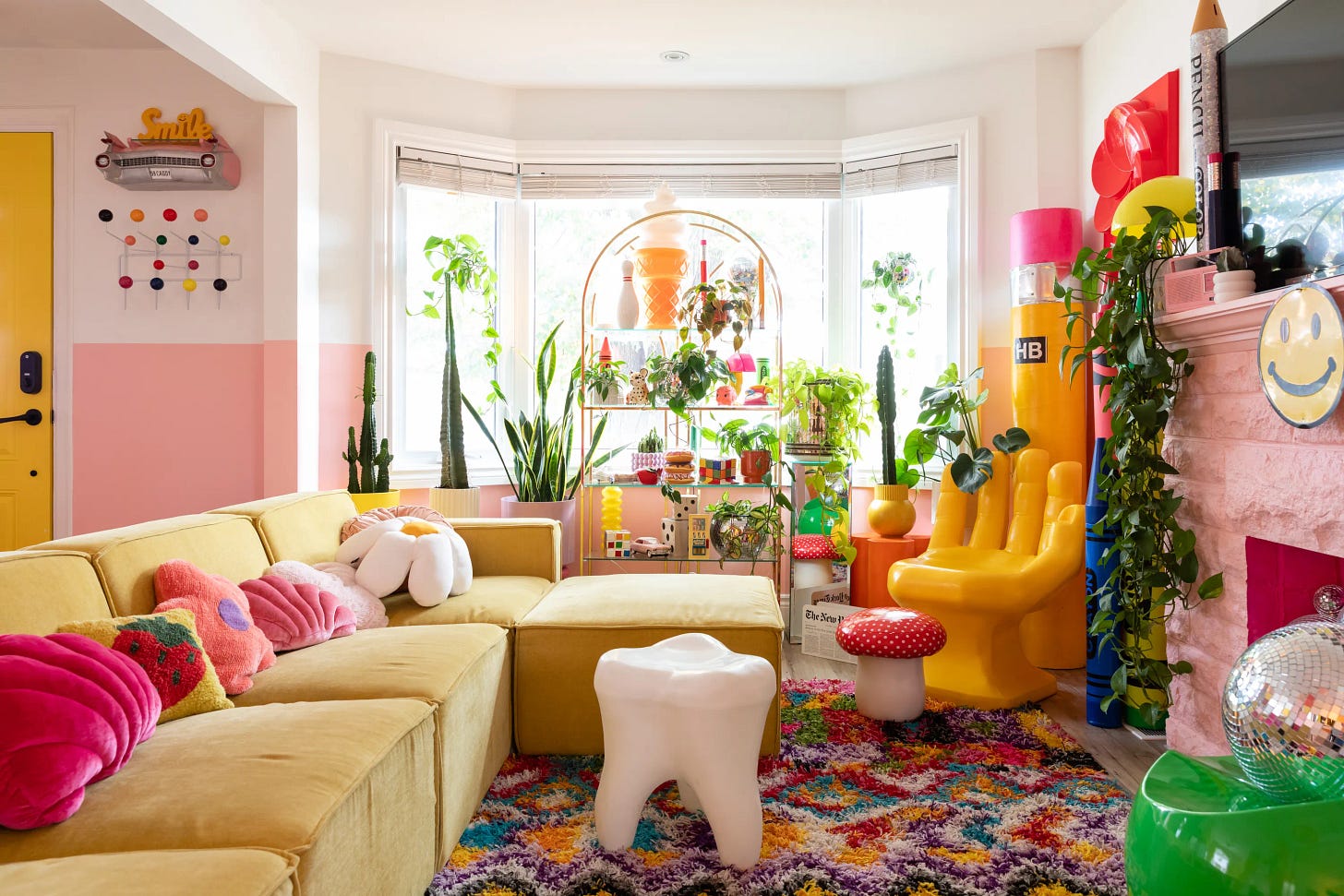
The trendiest products seem to be shaped like foods, which I really don’t get, and I wish all of these things were Christmas tree ornaments instead. There will always be room for the occasional novelty item or cat-shaped cookie jar, but at its best, this stuff makes a place look like a very cool kids room.
Gallery Walls
CONTROVERSIAL!!! HEAR ME OUT!!! I’m not going to get into the nitty gritty because there is so much to say and so many ways to make these. The premise of a gallery wall — a bunch of art on one wall — is solid. Go on YouTube and you can find hundreds of videos explaining what makes the good ones good, like frames that don’t match but do “go” together or having a particular color palette.
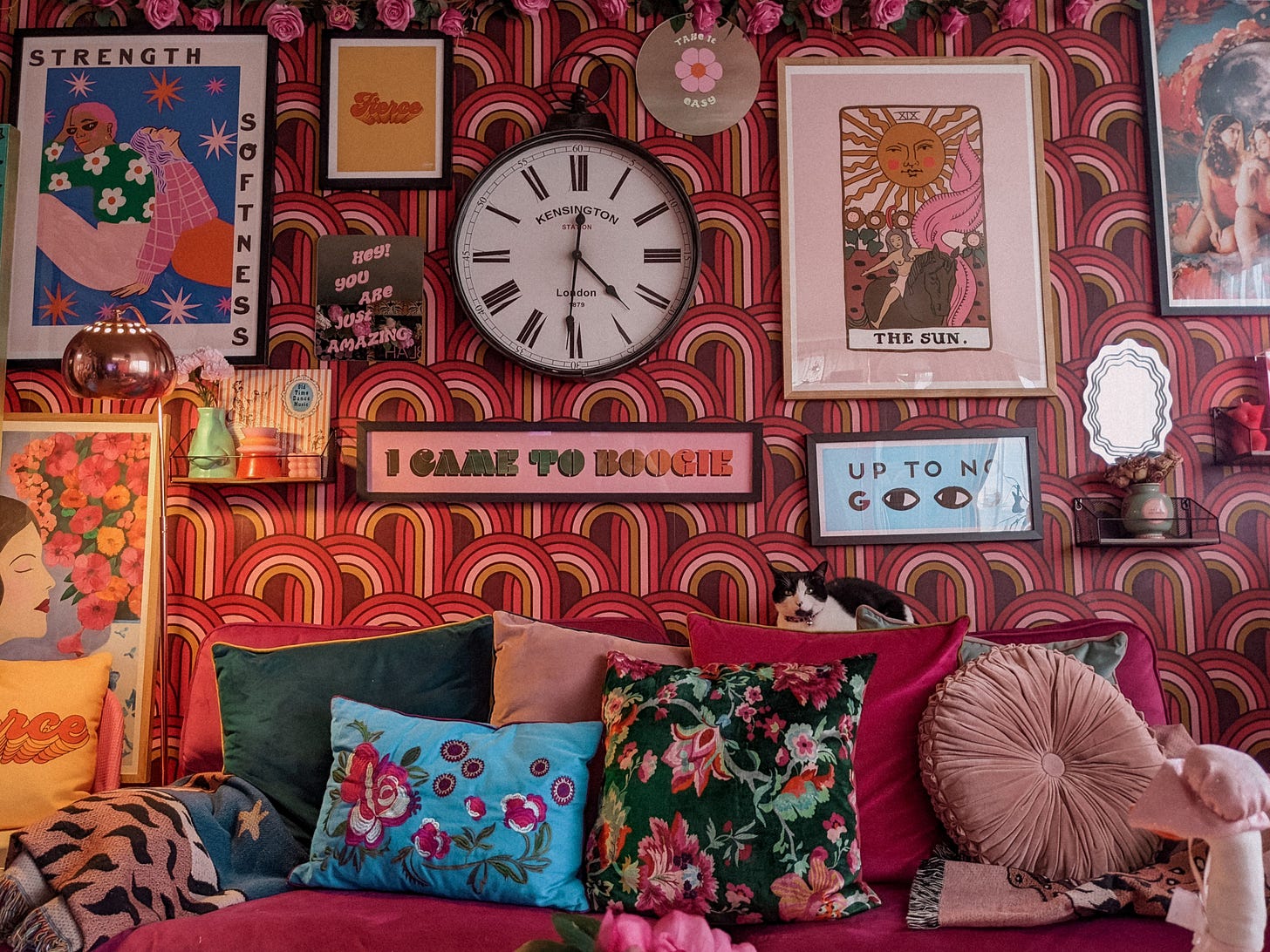
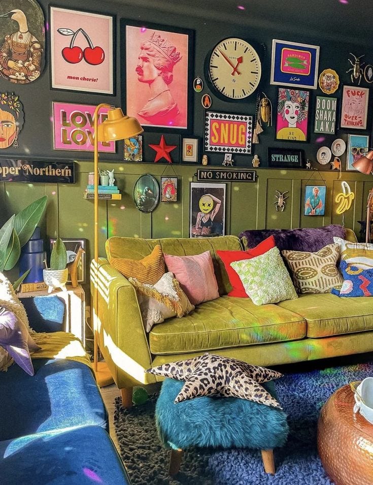
My thing is…deep breath…I think people my age are using gallery walls to disguise the fact that they don’t have (slash can’t afford) any good art. Putting a fun ad ripped from a magazine, a vintage postcard, an old Polaroid, a well-designed TV quote and your college diploma in frames and arranging them over your couch does not look cool. It looks messy and random.
And if you want to find a cute way to display your favorite pictures, memorabilia and trinkets, that’s totally okay! Your bedroom and fridge are great places to do that. Or heck, a smaller wall in your living room, make a focal point, go for it. But the whole will never be greater than the sum of its parts. If an item looks like “a thing” by itself, it won’t magically be turned into “art” merely by proximity to other art-ish pieces. I do not think a good main decorative statement is “here’s ten images I like.” Invest in one image you love.
Maximalism
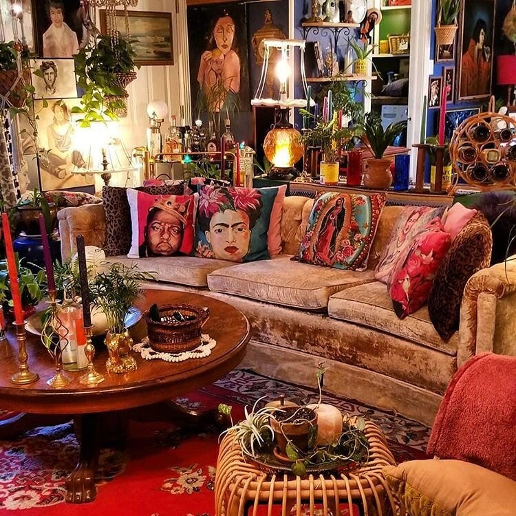
What do you get when you combine the above three trends? Maximalism, or, “more is more.” I don’t like it. I don’t like minimalism, either. I don’t want to walk into a room and think of an “ism,” I want to think, “this is a nice room” and then get on with whatever I went in there for. And maximalism gives me a headache.
At its best, maximalism feels louder than it does welcoming, and makes me wonder if the person who designed the room has the personality to match. If you’re Dita Von Teese and you do have the personality to match (and you tie the room together with dark red so it’s not overwhelming), you can get away with it.
But maximalism at its worst…
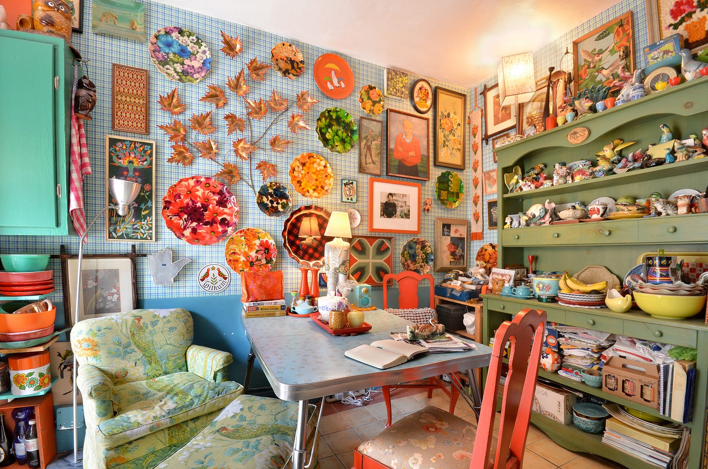
Quirky.
Call it “dopamine decor” if you want, this is TWEE and we are OVER TWEE.
You can’t touch anything without knocking something else over! Walking into store after store and buying the most eye-catching thing there doesn’t add up to an eye-catching interior, it adds up to the eye having no place to land, so visitors won’t even see any of your special stuff, they’ll just see WOW, LOTTA STUFF.
Burn It!
You need to get this shit out of your apartment yesterday.
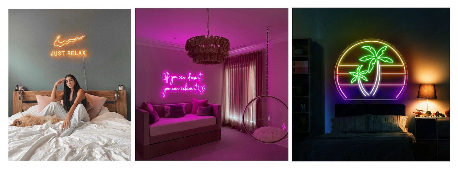
Neon Signs
Do you live in a trendy matcha café? A gym in a gay neighborhood? An outdoor cocktail bar? No? Then what is this doing in your HOME?
Funko Pops And Other Toys
Put your Wizarding World of Harry Potter merch in a box in the closet where it belongs, virgin!
If you disagree with me, do whatever you want. I am not in charge,
Lizzie


